Hugo
Sarah
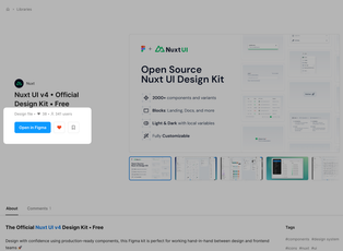
From Figma to Nuxt, faster.
From wireframe to production in no time with the official Nuxt UI design kit for Figma. Get access to all components, layouts, and enhanced design-to-code efficiency in one comprehensive kit.
- Advanced Figma FeaturesComponents, Local Variables, Auto Layout, Variants and more.
- Instant ThemingCustomize your design system instantly using local variables and tokens.
- Complete Design KitAccess all components, blocks, and templates in one comprehensive kit.
Everything you need in a single file.
Design and development in perfect sync with our comprehensive Nuxt UI design kit. Developers can implement designs faster, while designers work with production-ready components.
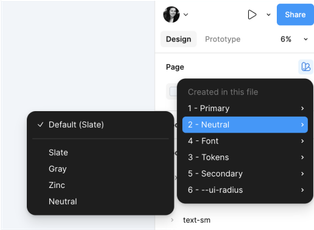
Customize in a few clicks to fit your needs
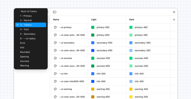
Control your entire design system with Figma Variables. Update primitive tokens once and watch your changes spread across the entire system.
- Style with color variables powered by Tailwind CSS colors
- Apply over 500+ local variables across your entire file
- Build with unified tokens for consistency
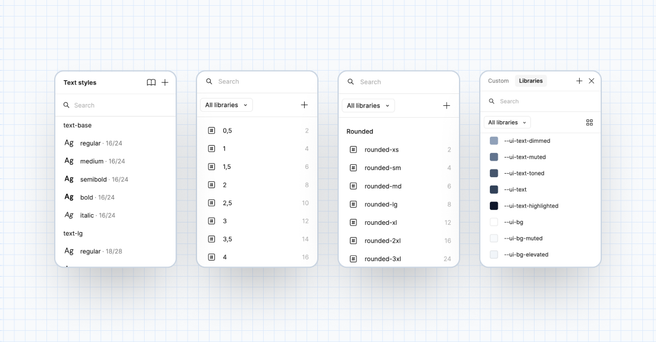
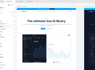
One component, endless possibilities
Create unlimited variations through nested components and swappable instances. Every element is fully themeable with props and slots, giving you complete control.
- Choose between 20k+ components and variants
- Customize designs with swap instance
- Switch between light and dark modes in one click
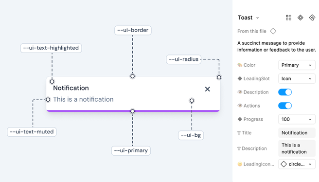
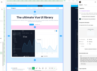
Perfect match with development
Our Figma kit perfectly matches Nuxt UI components, ensuring complete alignment between design and development.
- Match development standards using the same props and tokens
- Access Nuxt UI components through direct links
- Work together as design and dev teams share one component language
Start designing now.
From Figma to deployment in simple steps.
Get instant access to production-ready components and start creating.
Get instant access to production-ready components and start creating.
1 Open & Duplicate
Visit the Figma Community page and duplicate the file directly to your projects.
2 Customize to your brand
Set your colors, typography, and styles to match your brand identity in minutes.
3 Design your website
Design beautiful interfaces with production-ready components. Drag, drop, and customize.
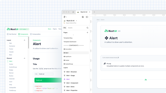
4 Share it with your developers
Perfect development handoff with components that match Nuxt UI's structure exactly.
- Ready-to-use TemplatesProduction-ready templates for marketing sites, documentation, and more included.
- Well-Documented SystemComplete guides for designers and developers to master your design system.
- Icons PackComplete Lucide icon library included - 1500+ ready components.
Used by 2,000+ developers & designers around the world.


Frequently Asked Questions
If you can't find what you're looking for, email our support team and if you're lucky someone will get back to you.
Yes. You don't need Figma's paid plan to use our UI kit.
Just visit the Figma community page and duplicate the file to your account.
Yes, you can use the UI Kit for commercial projects and sell your designs that utilize the components.
Yes, you can create multiple projects for multiple clients, there is no limit to the number of projects you can create.
Email us at design@nuxt.com with your details and we'll help you out.
We recommend the open source TemPad Dev inspect panel with the TemPad Dev Nuxt UI Plugin: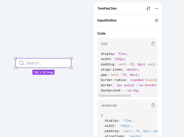
- Install the TemPad Dev Chrome Extension
- Open your Figma file with Nuxt UI components (reload the page if you don't see the TemPad Dev panel)
- Install the
@nuxtplugin in TemPad Dev's plugins section - Select any Nuxt UI component and inspect the code it generates